
GLOBALVARS
0

This is an edition of Heatmap Daily, an evening review of the day’s news written by our executive editor. Sign up for it here.
Oil prices are surging. The global crude benchmark Brent traded at more than $108 a barrel on news that Saudi Arabia has canceled some oil shipments to Europe.
In the ‘physical’ market, where companies buy and sell actual oil to use and burn, the commodity is now trading at more than $120 a barrel. In the United States, gasoline and diesel prices are spiking nationwide — $7 a gallon diesel could soon be possible. At a gathering of Group of 20 energy ministers in Houston, oil executives said they are running out of tools to blunt future price increases.
Which brings us to the topic of today’s newsletter. Say you wanted to know: How high have gasoline prices gotten in the United States? How expensive is gasoline now compared to President Trump’s first term — or the crisis that followed Russia’s invasion of Ukraine? There are various third-party data sources you could look at to get an up-to-date look — AAA and Gas Buddy come to mind — but neither makes it easy to see historic data. And even if you could access their old data, you’d need to adjust it for inflation, which means picking a good deflator, running a statistical analysis … and at that point, who has the time?
Lucky for you, the U.S. Energy Information Administration, or EIA, already maintains a long-running data set of the average gasoline price, inflation-adjusted and updated every week. It’s historically been kind of a pain to access, because you had to download the data as a raw spreadsheet and then visualize it yourself. But thanks to a new website, which went live on Monday, you can now draw a quick chart and see: Gasoline is now more expensive than it was at any point during Trump’s first administration in real dollars.
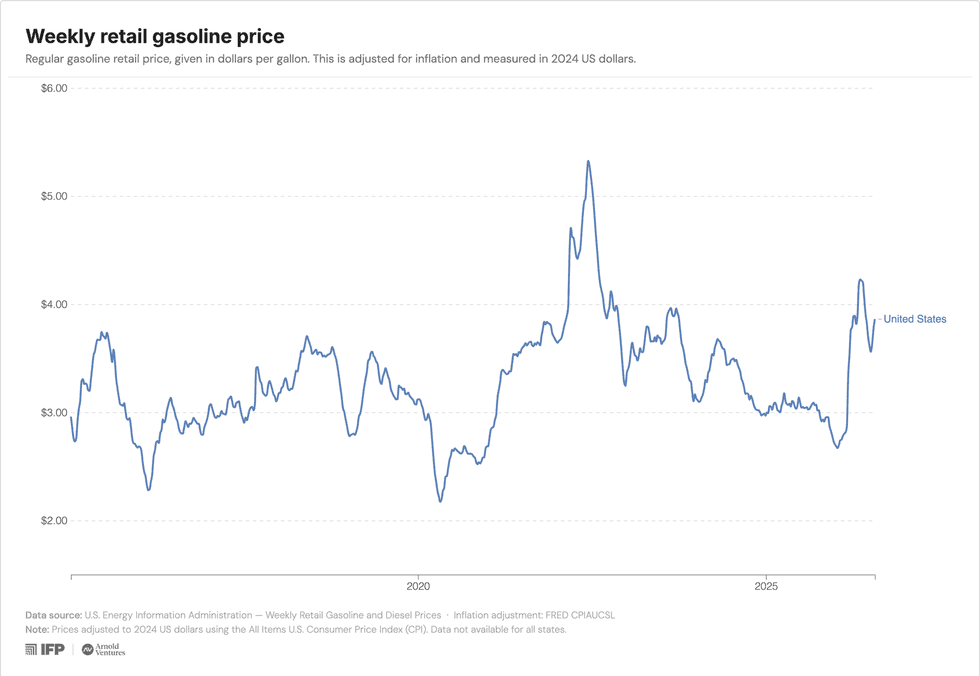
But it’s still well below some of the records that it set in the late 2000s and early 2010s:
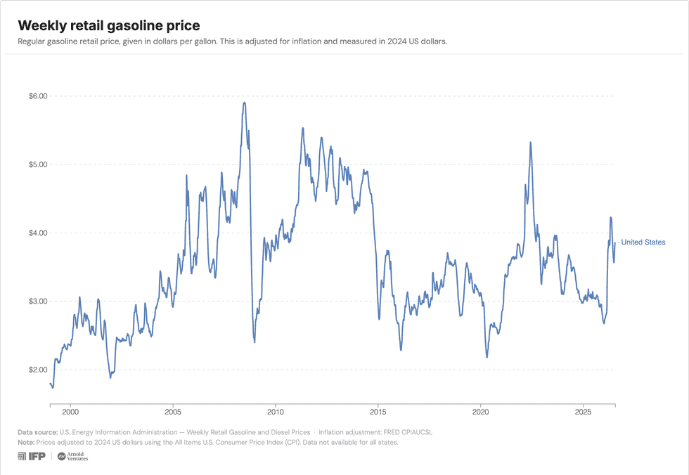
These charts are from the excellent new website U.S. Energy Data. It’s a collaboration from the philanthropic organization Arnold Ventures, the think tank Institute for Progress, and the data scientist Hannah Ritchie.
I’m really excited about it. Here’s the deal: The EIA is a federal agency that maintains impressively detailed and up-to-date data on virtually every facet of America’s energy and industrial economy. But that data is often difficult to access or is buried in the agency’s website. And while subject-matter experts are often familiar with the EIA’s statistics and how to use them, it still takes time, dedication, and some expertise to use them well.
The new U.S. Energy Data project gets rid of all of that work. Now, you can browse the EIA’s statistics for power prices, electricity demand, electricity generation, hydrocarbons and biofuels, and power reliability. You can chop up the data on a state-by-state basis, remix it into new charts, and link and export the charts for use elsewhere.
The new project is inspired by Our World in Data, which Ritchie helps edit. That project collates and visualizes data about the biggest questions in global economics, demographics, public health, poverty, energy use, and more — but it doesn’t have any subnational data. That’s one reason why the new U.S. Energy Data platform is so nice to have.
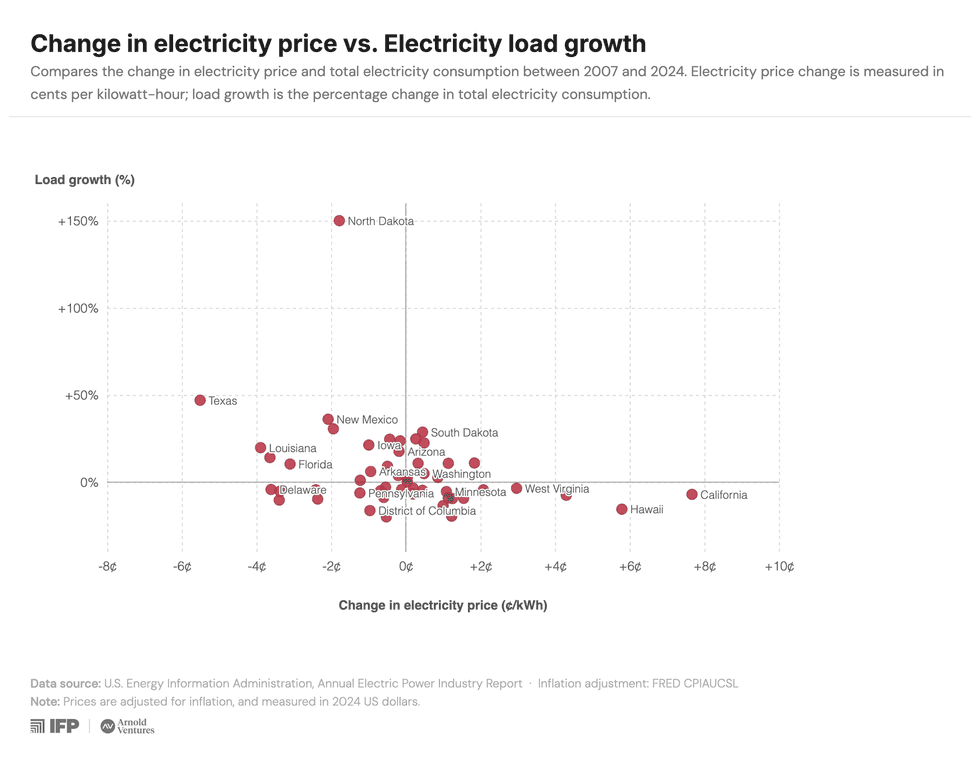
So with the new site, you can see, for instance, whether states with the most electricity demand growth have seen power prices rise or fall:
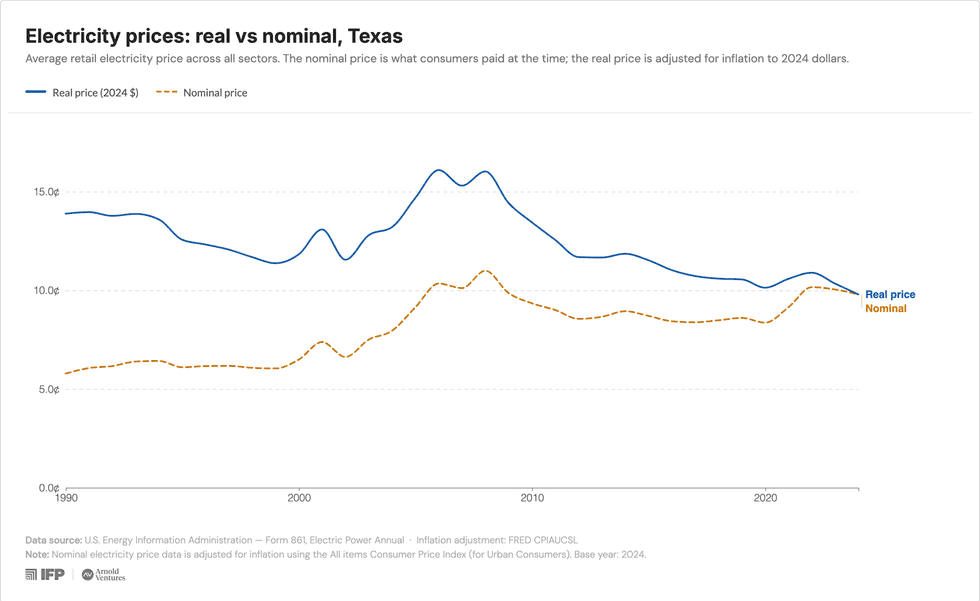
Or compare real vs. nominal electricity prices in Texas and California:
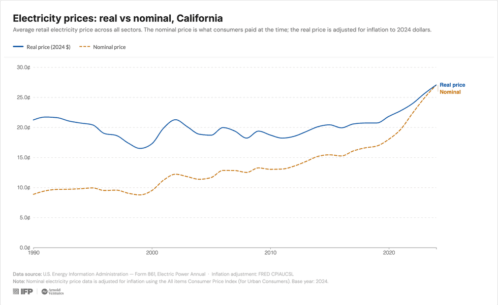
Or look at how dry natural gas production — which subtracts natural gas liquids like ethane and butane from the production of the fuel gas itself, and is actually “the metric that is most commonly quoted for ’natural gas production’” — has changed over time per state:
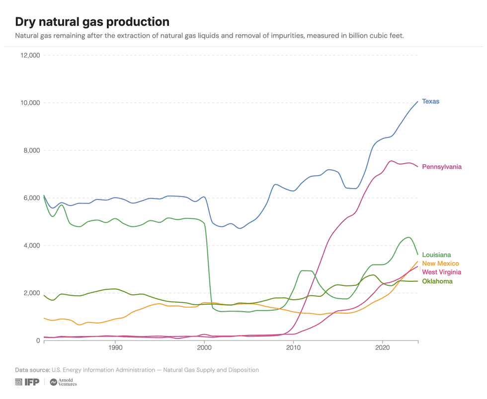
You can also look at how the EIA quantifies power grid reliability and compare the states that have the most blackouts overall against the states that see the highest amount of time that an average customer goes without power.
In short, I’m very excited about it, and I suspect that many Heatmap readers will get a kick out of it. Go click around now — and also remember if you’re curious about hyperlocal electricity price data, we may already have you covered at the Heatmap Electricity Price Hub!